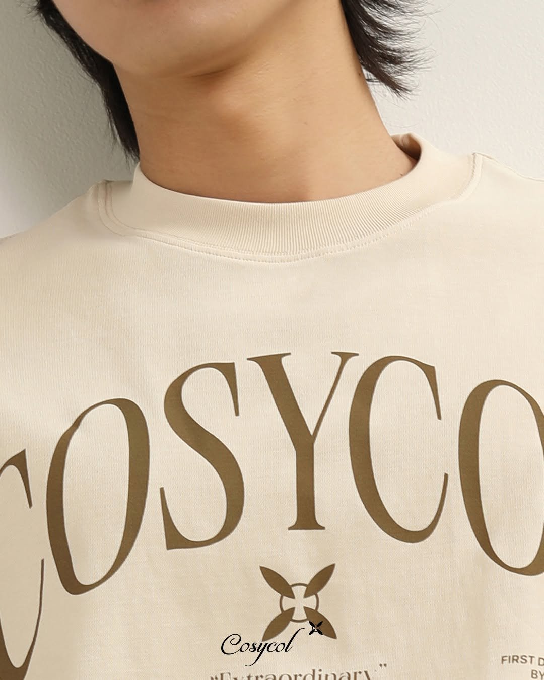
The cream Cosycol tee uses large lettering as a strong front feature. For a new cotton-tee project, the design question extends beyond whether the type fits on the panel. Coverage, fabric movement and the finished hand of the decoration also influence the customer’s experience.
Use artwork at the intended physical size
Export a clearly scaled production file and include a width and height reference. Keep counters, fine gaps and small secondary lettering visible in the approval. A small digital preview can make a complex graphic appear simpler than it will be to produce. Review the artwork on the smallest and largest planned bodies before assuming one size will suit the full range.

Compare the feel of the decorated panel
Ask for a representative trial using the selected body fabric. Large solid areas can change the feel of a garment, so evaluate the graphic while the tee bends and hangs naturally. The appropriate technique depends on the artwork, material and production scope. Do not identify Cosycol’s process from the photograph. Use the image to explain the visual direction and the physical trial to choose a suitable method.
Keep the type aligned with the garment
Define centre front and the chosen vertical reference clearly. Check the graphic standing and seated, then inspect it after the agreed care procedure. If the shirt changes shape or the graphic develops an unwanted appearance, record both observations. A perfectly centred digital file is not enough if the decorated sample feels uncomfortable or the garment no longer fits the intended silhouette.
A practical development example
A brand considering a broad filled wordmark could compare the intended version with an approved more open variation on the same fabric. Judge visual strength and hand feel at normal wearing distance. The comparison should answer a specific design choice. It should not become permission for the supplier to alter the logo without approval.
| Area | Review | Agree |
|---|---|---|
| Scale | Review type at finished dimensions. | Readable details and size-range coverage. |
| Hand feel | Compare the decorated fabric during movement. | Acceptable coverage and flexibility. |
| Alignment | Use named seam references and a centre line. | Placement on the final body. |
Does a large graphic automatically need DTF?
No. Several decoration systems may be suitable. Compare the real artwork, fabric and quantity with the decorator, then approve the selected process on a sample.
Discuss your T-shirt project with VIENA
Include final-size lettering, the intended fabric and your preferred feel in the enquiry. Ask for an approval trial before treating a digital mockup as the finished-product standard. Request a project review.
Related manufacturing guides
- Screen Printing on Cotton Tees: A Brand’s Approval Guide
- PET and DTF Transfers for Streetwear Graphics
- Screen Print or DTF? Comparing a Streetwear Graphic
Technical reference
STAHLS’: decoration-method comparison. Public guidance supports the discussion; no test result or production specification is inferred for the photographed Cosycol products.